See the whole picture, from recruitment to departure, with one data-driven diagram.
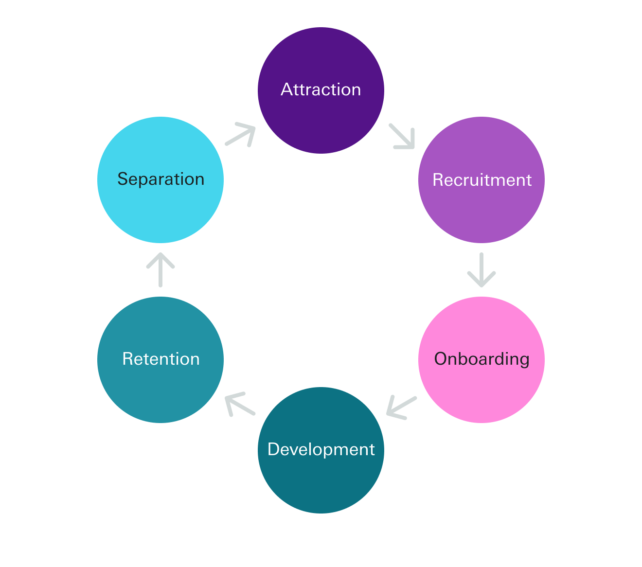
With more companies focusing on their workers’ experience, the employee lifecycle is getting more attention. The lifecycle starts, in fact, before one becomes an employee. The first stages of the employee lifecycle cover recruitment of applicants and selection of qualified candidates. This connects the quality of talent acquisition efforts to employee success later on. Here’s an example of the classic stages that most employee lifecycles include.

But how should we use this lifecycle to build the most effective talent strategies? It’s a nice framework, but the format above doesn’t give us room to layer on any data that can help us improve each stage.
Taking a systems approach
Your company is more than just a group of people moving from one step to another: it’s a complex system where these lifecycle stages are interconnected.
What happens at the end of one employee’s lifecycle impacts a job seeker’s decision to send in their resume.
The quality of our selection process determines how quickly new joiners will get onboarded and develop important skills. Thinking about the employee lifecycle with inflows (people entering the stage) and outflows (people leaving the stage) is one way to take a systems approach to the employee lifecycle.
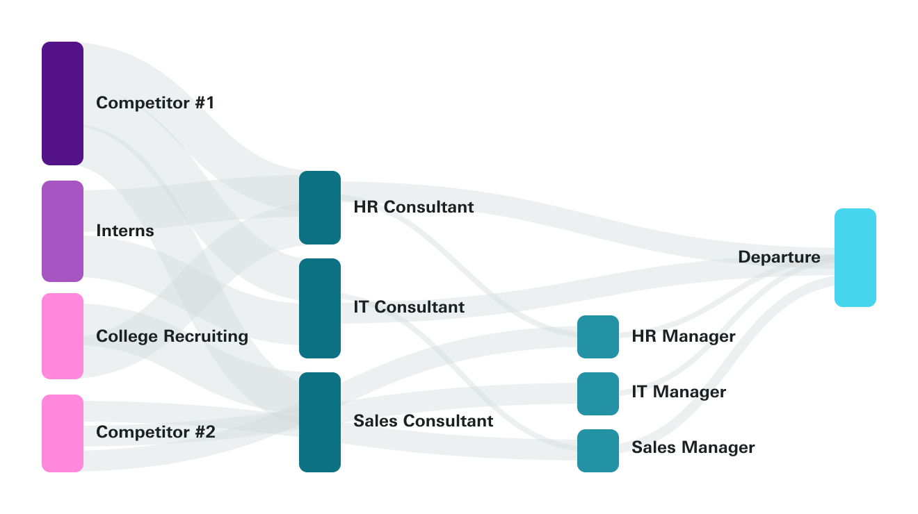
A Sankey diagram, like the example below, can show you all the key employee lifecycle stages at once with their inflows and outflows.

Measuring inflows and outflows in your company, departments, and levels
To build a Sankey diagram with your own data, first choose the time frame you’re exploring.
Then gather the information for each lifecycle from relevant data sources, including your applicant tracking system, your HR information system, and your learning management system.
Putting it all together, you’ll see how many people in your available talent pool become applicants, how many applicants become qualified candidates, how candidates become new employees, and which employees gain skills, get promoted, and leave your organization.
Now, senior employees’ lifecycles might look very different from lower level employees.
A fast-growing department, or one where workers need to learn many skills on the job will have a different lifecycle profile than a stagnating department or one where incoming employees already know what they need to do their work with little training.
Starting with this one interface, we can answer questions about employees’ experiences and paths forward in the company. Applying filters like departments, and performance levels can show you the difference in high and low performers’ journeys and where employees in pivotal roles go. This can spark ideas about how to design better experiences for all your employees.
Cause and effect: finding root causes and solutions with lifecycle diagrams
If one stage of your lifecycle needs to be improved, guess what you’ll find when you dig into that stage? You guessed it, more systems! Your selection, promotion, and even retention stages have multiple steps in each of them.
By mapping the way candidates flow through your hiring funnel or stacking the conversion of recruitment touchpoints, you’ll figure out more than just which lifecycle stage could be stronger. Pairing the full picture from above and the detailed stage-by-stage analysis, such as a process map that details the steps that employees go through when deciding to quit, gives you a powerful combination of priorities to focus on and tactical steps to execute.
For example, your business might be all-in on growing market share. Thus you need to invest in the go-to-market (GTM) teams and their people strategy. Looking at the employee lifecycle diagram, you could filter for GTM employees and focus on four areas. Insights on the source (“Where do I find good GTM candidates?”), training (“How do I give my GTM team the skills to succeed?”), performance (“How is each GTM team member contributing to our market share goals?”), and seniority (“What seniority levels are most important for executing on my GTM strategy?”) are good places to start. The employee lifecycle view gives you a way to compare different paths to reaching more market share through your people decisions.
This lifecycle mentality is a great way for professionals in employee experience and employer branding to visualize the paths that employees take. This makes the company’s strengths and weaknesses clearer, and shows how your organization organizes processes for different employee groups. To take a big-picture view of diversity, equity, and inclusion (DE&I), lifecycle diagrams can put pay gaps and retention problems front and center.

How Orgnostic can help
You can only build an employee lifecycle diagram if you have all this data in one place. Orgnostic can help by linking employee data from multiple sources, enriching it with employee experience and sentiment surveys, and applying diagrams with filters to visualize it. Finally, our platform lets you combine these lifecycle stages with other high-priority metrics, all in one platform. The cool thing about it is that you don’t have to be a data scientist to do all of this.

From the Talent Management series: