Pay inequity along gender and ethnicity can highlight other unequal processes in your organization.
Pay is a sensitive topic. Pay equity is even more touchy.
But paying some people less (or inconsistently) for their base salary can end up costing more in the long run by paying to replace employees who have left or by facing heavy pay discrimination lawsuits.
As uncomfortable as this issue is, you’re better off facing it in your company head on. With government reporting mandates and calls for more transparency on diversity, especially in tech fields, it’s not enough to hope that everything magically falls into place. You might have the best intentions to pay people consistent base salaries according to their roles. But unfortunately, many biases in decision-making mean there’s a gap between our intentions and our employees’ actual compensation packages. So how do we know if employees’ compensation is fair?
Let’s take a look at what information you need to test your compensation data for equity, how to calculate these metrics, and what to do once you’ve found them.
How do I calculate my company’s level of pay equity?
Pay equity comes from consistent and fair compensation across the people inside your company, and when comparing your salaries to those outside your business.
To answer the first, internal question of pay equity, you need to find your internal compensation equity. This is the distribution of pay amounts in each job role and seniority level. You can use this metric to make sure employees in your organization are paid fairly when they’re doing the same work at the same level.
To find this yourself, you need salary, job role, seniority level, and demographic information from your HRIS. If you use other databases to store some of this information, you’ll need to integrate those data together by making sure your databases can talk to each other. (Hint: Orgnostic can help you do this in just a few clicks!)
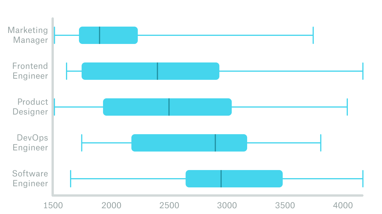
Then, you can plot the distribution of pay across job roles, gender, ethnicity, LGBTQ+ status, and other demographics. If you’re comparing demographic groups, use one chart for each job level to make an apples-to-apples comparison that keeps seniority and responsibilities consistent. To know if there’s a meaningful difference between groups or if these gaps are just noise, use a significance test instead of just eyeballing the graphs.
Here’s an example of how to visualize these groups:
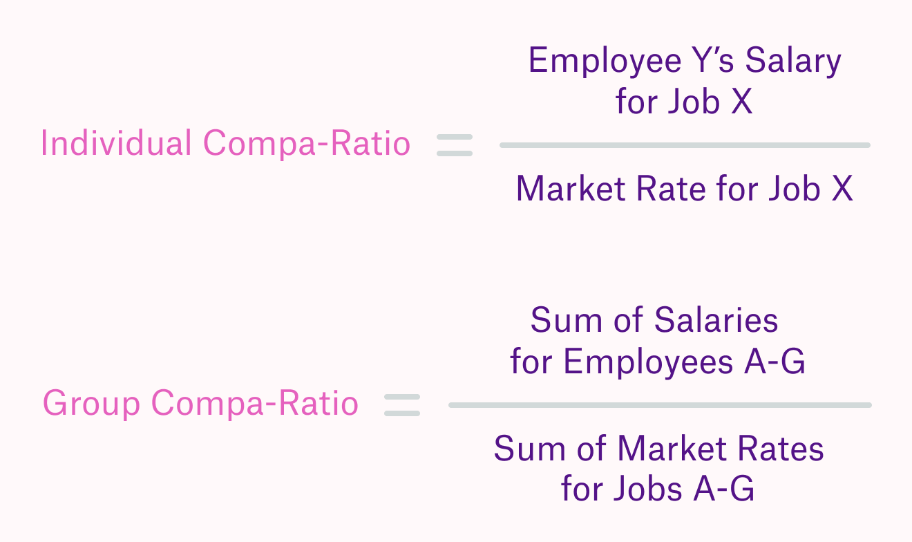
To answer the second, external question about pay equity, you need the compa-ratio. Short for comparative ratio, this metric shows you how close your compensation levels are to the market rate for that role. You can find market rates from many sources, like Payscale, SHRM, the Department of Labour, and tech-focused sites like Levels.fyi.
Calculate this ratio by dividing employees’ current salary by the market rate for the same job. You can find individual ratios for each employee and calculate a group comparative ratio. Like this:
This ratio gives you insight into the competitiveness of your salaries against the market value for the same positions. With these insights, you can make more informed compensation plans. Compa-ratios can help you balance labour costs, your ability to attract desired external talent, and candidates’ salary expectations to find the right pay levels for each job.
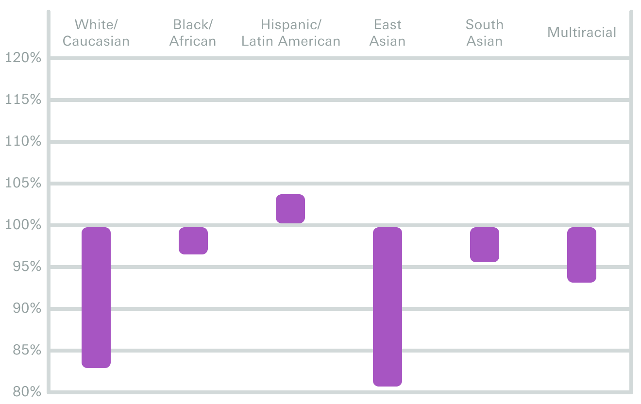
With these ratios, you can create charts that compare how each group is compensated relative to their value “on the market”. Especially in hot job markets like the present, you want to have high retention and offer acceptance rates.
Here’s what a chart like this could look like:
This can all be done with base salary data, to avoid complicating the results with other compensation factors like equity and bonuses. However, it’s worth investigating how your performance-based pay and stock or equity grants are divided amongst employees using the same steps.
So what?
Did your company reach pay equity across demographics groups in each role and seniority level, plus your pay inside the company compares well with those offered outside? Amazing! Enjoy your pay equity and try to maintain it. You can also check that employees actually see your process as fair using our talent management survey — you might know that you have a balanced process that is fair to all groups, but others might not feel that way.
Found some pay inequities? Don’t worry; there are a few ways you can find the root cause of these differences and address them. Here are some potential reasons for pay inequity:
- Inconsistencies in starting salaries: If your pay reflects negotiation skills more than critical on-the-job abilities, you may be creating systematic pay differences. Stronger compensation research, better total rewards offerings, and tracking offer rejection reasons can help you make offers that more candidates want.
- Inaccurate high-performer or high-potential designations: Your high-potential programs, if you use one, should contain people who have the right job-related qualities. Some high-potential programs are filled with people who only look like leaders, but may not act like them. Your high-performer and -potential systems could benefit from more structured performance evaluations. More structure will make it harder for managers to have a different performance standard for each employee.
- Systematic differences in time to promotion: Are some employee groups overlooked for promotion? This might be feeding into your pay equity challenges. If promotion tracks are different for some employees than others (based on demographic traits they have), this will show up in pay inequity and is part of the reason behind some pay gaps we see. Tracking time to promotion for your employees will show you whether this is an issue. From there, setting clear performance, skills, and behavioural standards for promotion will bring structure to an often subjective decision.
Pay inequity is tricky.
We’ve tried to demystify it for you here, but there are many more steps to setting and keeping equity between your employees. Our metrics and surveys are a great start for your journey towards equity. From there, you can turn those numbers into real change by making work fairer for all your employees.

From the Diversity, Equity, and Inclusion series: